Re-designing Guide Discovery
Background
Guidebook makes it possible for anyone to build mobile apps using our builder application (CMS) without needing to know how to code or design. Our platform is home to many different types of apps for events, places, venues, universities, and organizations.
Guidebook App vs. Branded App
The Guidebook mobile app is similar to an app store. Instead of apps, users discover guides which they can download and view. Some clients prefer to build their own branded app which acts as a home for the guides they create. Their users discover these branded apps in Google’s Play Store for Android and Apple’s App Store for iOS. The benefit of creating their own app instead of using Guidebook’s app is customization and branding where clients can use their own unique branding guidelines including color scheme and logos.
2 Types of users
There are 2 distinct types of Guidebook users —
(1) App owners (clients): build an app for their target audience (typically for events, schools, venues, or enterprise).
(2) App consumers: use the app that app owners build.
While we don’t have a dedicated user research team, we constantly receive feedback from clients, users, our customer support and product marketing teams. For this project, we evaluated each user type and their needs to understand what we were trying to solve and form clear goals.
Business to Business to Consumer (B2B2C)
Guidebook’s B2B2C model adds an extra layer when considering user vs. business needs. This means there are now 3 players and 1 of them is both a user and a business.
We found addressing many of the user and client needs would in turn meet Guidebook’s business needs. For example, better branding will help attract new clients and self-service will decrease the number of customer support calls for simple tasks.
The first part of this project is app-focused where the user is the app consumer. The 2nd part is desktop-focused where the user is the app owner (client).
Part 1: Guide Discovery
iOS & Android for app consumers
One part of this project involved updating guide discovery in our iOS and android apps.
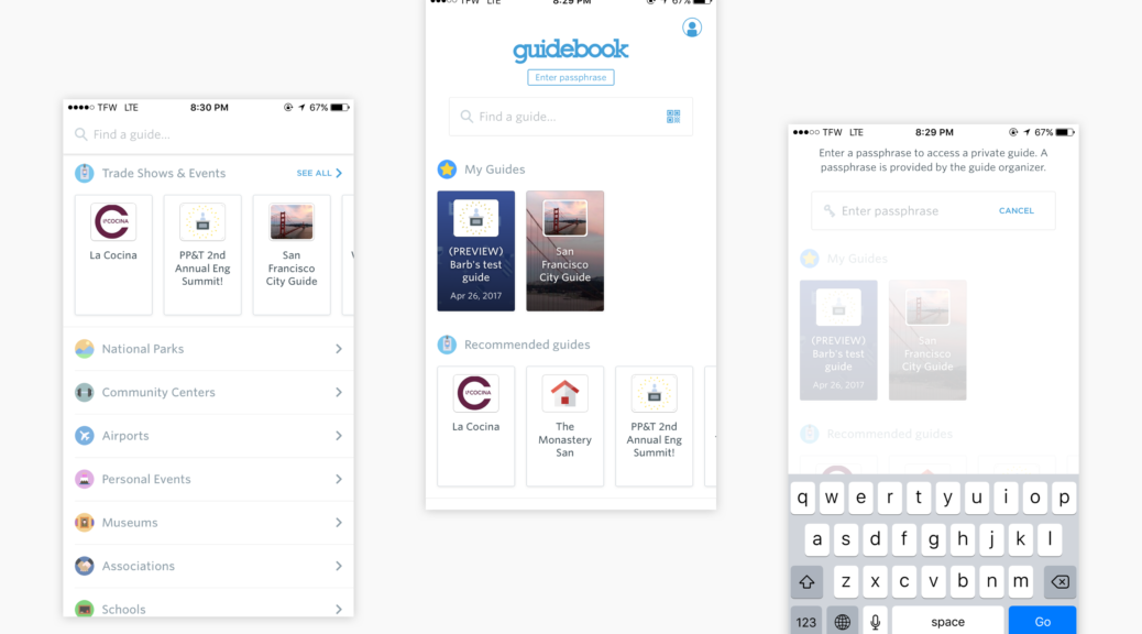
Guidebook app: Before
Part of our process was to pinpoint the strengths and weaknesses of our current implementation of guide discovery in our mobile apps. The screens below are from guide discovery on our flagship Guidebook iOS app — home to over 30,000 guides including public, passphrase protected, and invite-only.
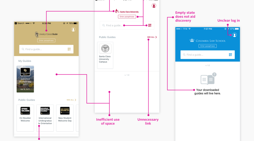
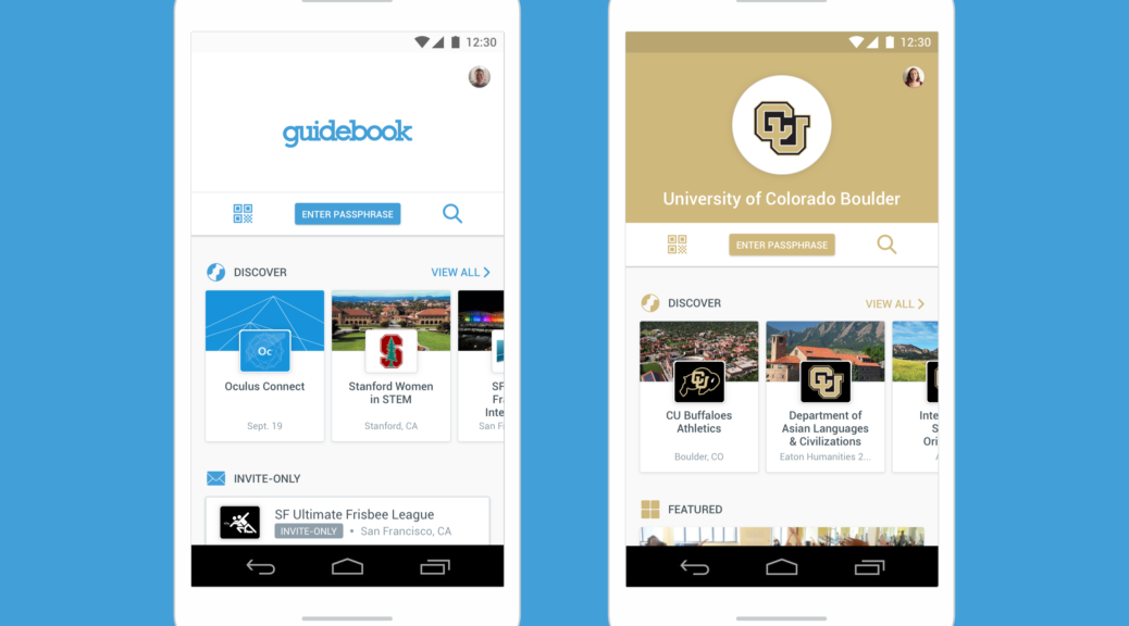
Branded apps: The design doesn’t scale
While the patterns and layout seemed to work in the Guidebook app, they didn’t scale well when applied to branded apps which can include between 0–1,000’s of public guides. When an app contained zero public guides, it caused the branded app to appear empty with no content.
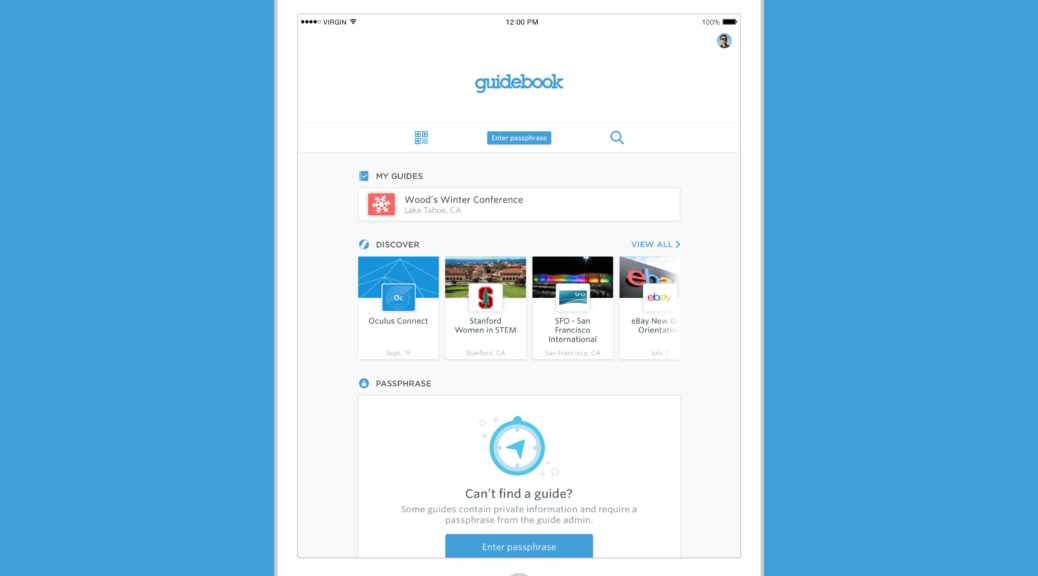
Where’s my guide?
On both the Guidebook and branded versions, users were frequently confused about how to find the guide they were looking for if it was hidden by a passphrase or invite-only. Passphrase protected guides require the app consumer to enter a passphrase provided by the app owner in order to discover and access the guide. Invite-only guides require the app consumer to log in to an invited account to discover and access the guide. These 2 common privacy settings confused app consumers when trying to find these types of guides.
Improved card types
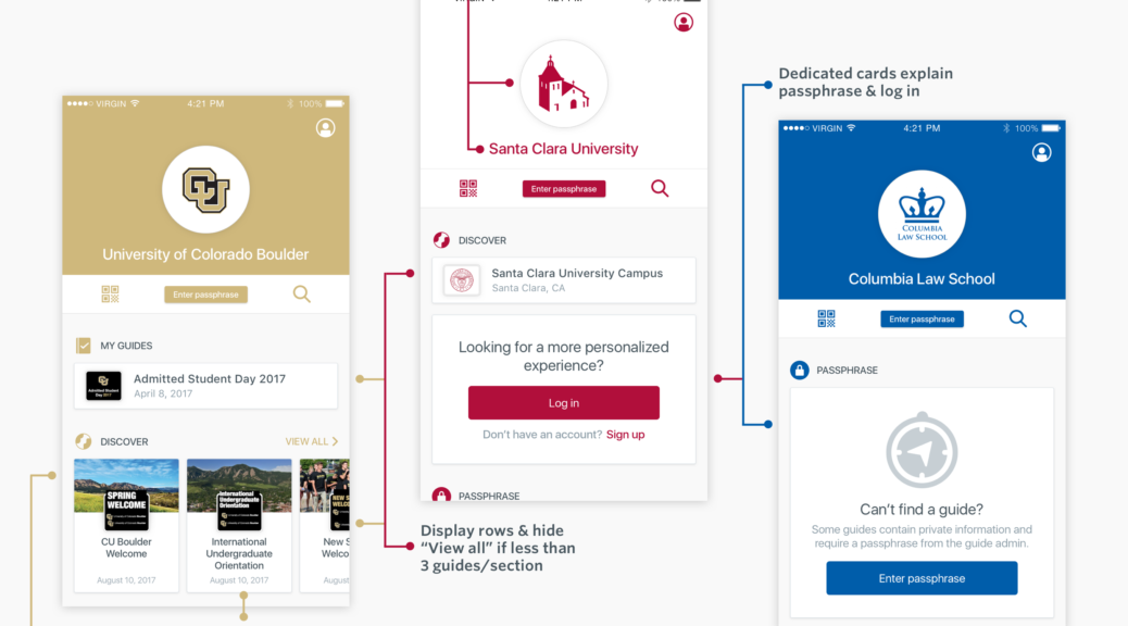
- Informational — these cards assist users in understanding different functions of our apps. For example, the idea of needing a passphrase to find private guides is not common across other apps and therefore does not match users’ mental models. To address this pain point, we created a smart card dedicated to explaining passphrase to first-time users.
- Adaptive — our guide cards now change based on the number of guides in a section. Previously, guide cards had one fixed size, but that didn’t work for sections that only had 1–2 guides. Now, if a section has less than 3 guides, the cards will display in rows to make better use of space in the app.
- Visual — each guide contains cover images. We wanted to pull these out into the cards because these images are unique to each guide and provide users a better scanning experience when browsing.
New header
This area is important to branded apps because this is where app owners display their name and logo.
- Separation of logo and name — previously, the only way to display the app’s name was in the logo image. This resulted in skewed and stretched logos. The redesign displays the app’s name separate from the logo so users can upload their logo without needing the text. This results in better, clearer branding for clients.
- Animations — Custom animations for passphrase and search bring the app to life.
New sections
In addition to the existing “My guides” and “Public guides” sections, we created new sections to surface and group guides to increase discoverability.
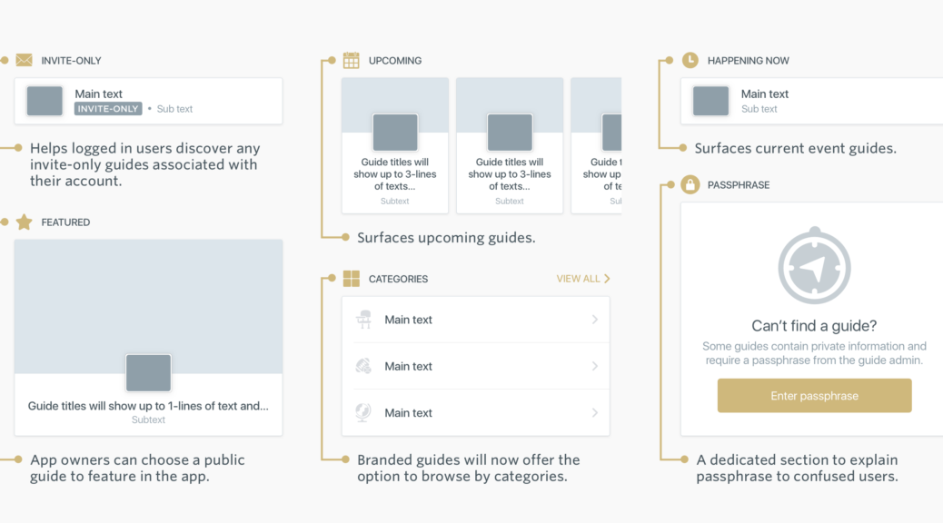
With this new card-based design, it’s easy for us to create and experiment with new sections moving forward. In the days leading up to this release, we realized current event guides were hard to discover since they no longer displayed in the “Upcoming events” section. Adding the “Happening now” section was last-minute and required minimal front-end and back-end work using the existing components in this new design.
More than a single page
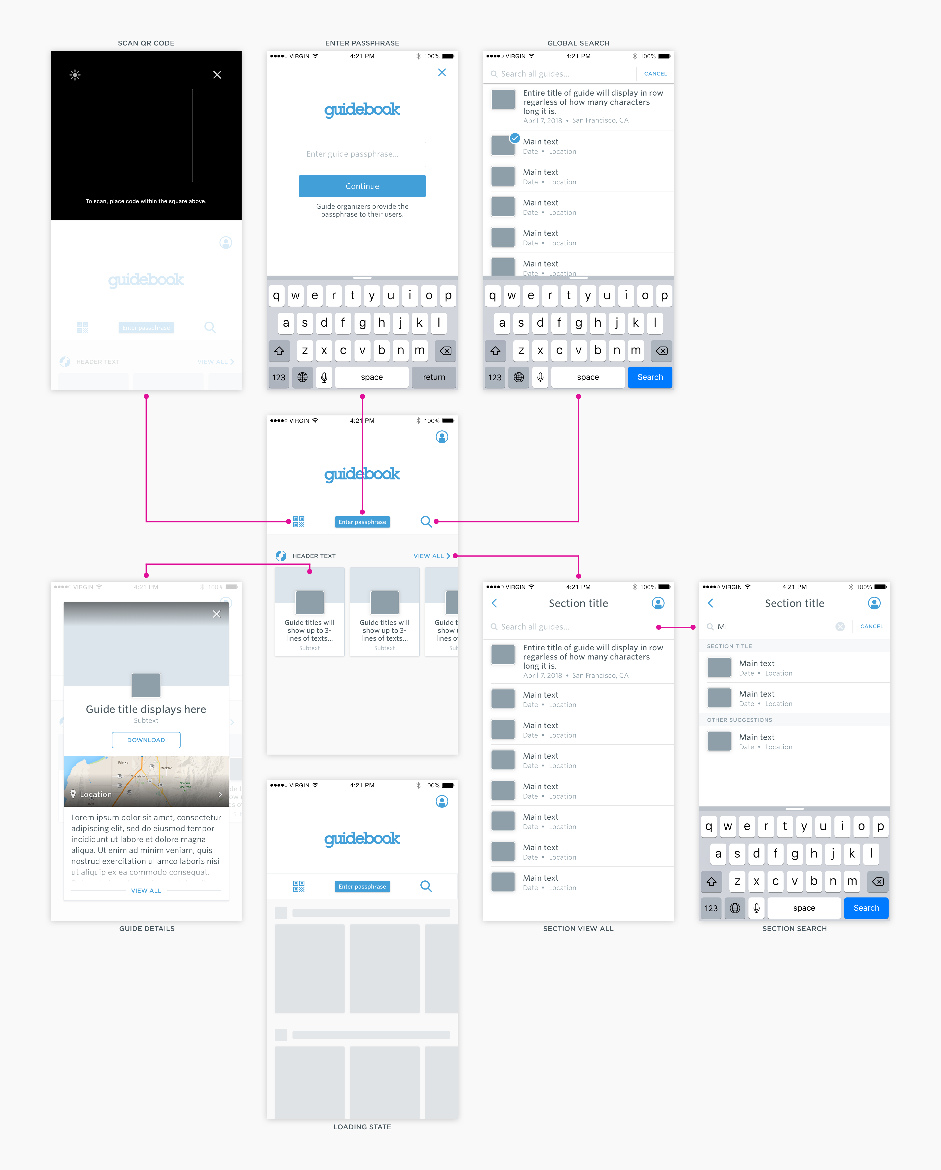
This re-design touched more than the guide discovery landing page. You can see some of that work below including search, loading state, and guide details.
Room for improvement & other observations
We know there is plenty of room for improvement and iteration. One example is that the MVP does not ask users for their location in order to surface guides nearby. Without using for the user’s location, we see guides surfacing next to each other that are in completely different locations irrelevant to users.
With the addition of the happening now section, we noticed guides surfacing that have start dates from over a year ago. We realized many guides were not properly managed and it was apparent which guides were abusing/misusing the system. For example, if a user creates an event guide with the dates listed over the span of multiple years then they could get around the expiration and archiving constraints set on guides.
Measuring success
We want users to be able to easily find their guide in order to decrease confusion and customer support contact. So how will we know if we’ve achieved this with the new design? We’re tracking usage metrics including the breakdown of all guide downloads by method and comparing this to the old version. In addition to looking at metrics we will continue to seek and receive feedback from our clients and users. Continuing this communication will be key as our product and technology evolves.
Android
iPad & Tablets
Part 2: Content Management System
Desktop Builder application for app owners (clients)
The second part of this project involved updating our content management system for guide and asset management within App Dashboard. This functionality was previously only available to our customer support team. As part of Guidebook’s app automation goals, however, these features needed to be available to clients. We needed to update these tools so anyone could easily manage the guides and assets in their apps.
User & Business Needs
One major client need that overlapped with Guidebook’s business needs was to increase the amount of control client’s have over their app and content. Meeting this need would also decrease the amount of customer support contact because clients would not need to rely on customer support for simple tasks.
Observing client’s needs helped guide us to a few of the new sections in guide discovery. Clients wanted to be able to promote and organize guides. This translated into the creation of a featured section and categories.
App Dashboard
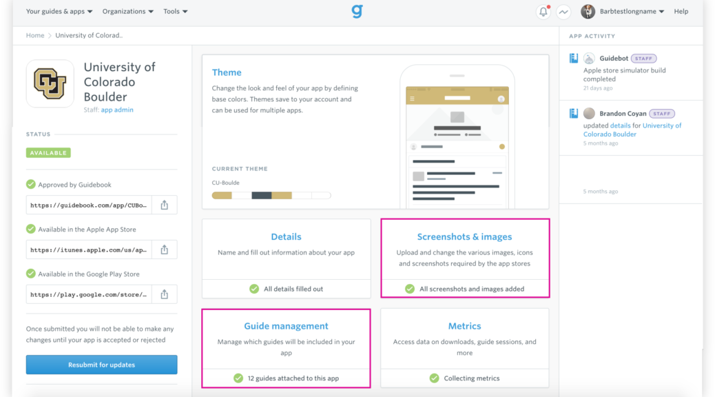
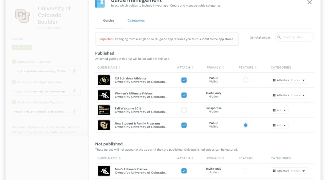
Guide Management
We needed to update this tool since it assumed the user was a power user (ex. customer support) who already understood our product and various use cases. We also needed to add functionality to allow users to create categories and feature a guide. One major focus on this page was to communicate to the end user whether or not their guide was visible or hidden depending on the publish and privacy state.
Want a personalized demo of any of the updates mentioned in this post?