Introducing a major overhaul to Guidebook's schedule feature
The schedule within the Guidebook app has always been one of our most important features. In fact, end users access the schedule module nearly 3x that of any other — it is clearly an integral part of the experience of navigating a guide. With that in mind, and our consistent drive to iterate on and enhance our product, we decided it was time to start re-thinking the schedule.
Goals
We established a number of goals when setting out, not all of which we’ll detail here. The main areas we wanted to address:
- Allow the schedule to work better with really short and really long (year-round) guides
- Unify the week schedule view with the (outdated) month calendar view
- Adjust the UI based on the state of the guide
- Enhance the track filtering user experience
Improving the day picker
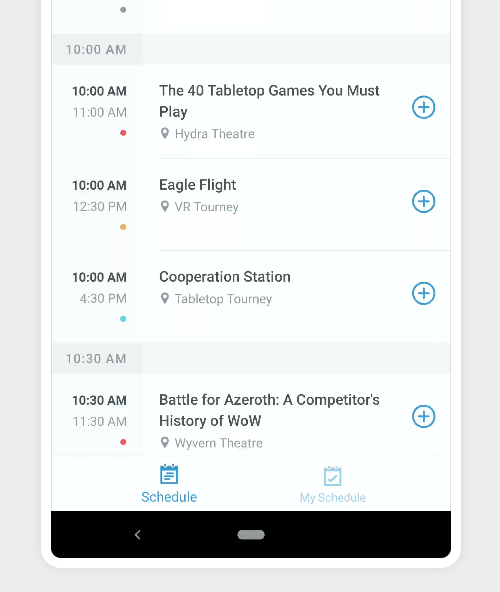
The day picker is the section at the top of the schedule where you select which day you would like to view sessions for. Previously, there existed only a single type of picker: the scrollable week picker. This worked OK, but wasn’t ideal for guides which were very short (1-4 days) or guides which lasted longer than 2 weeks. The information in these two scenarios was simply not displayed optimally.
In the new release, we’ve implemented a completely new day picker. The new picker now has three separate modes, one of which is selected automatically to best suit current guide. The three modes are:
Short picker
The short picker is used when a guide has a duration of anywhere from 1 to 4 days. This picker is simpler, cleaner, and more focused around the days you really care about as a user.

Medium picker
The medium picker is essentially the same as in the previous versions of Guidebook. The picker will display up to two weeks, in a horizontally scrollable section. This is ideal for guides that are about 7-14 days in length, as it allows us to render a full week in a single view, but without any added complexity.
Long picker
The long picker is probably the biggest change being introduced with the new schedule redesign. This picker initially renders as a week picker, with a caveat. You can drag down on the view (or use the drag handle) to expand the picker into a full-fledged month picker. This is great for guides that span longer than 2 weeks as it gives you access to the entire calendar year to quickly jump to days far in the future or past.

Improving the filter user experience
Filtering sessions is another integral part to navigating the schedule view. Often guides will have hundreds of sessions, so being able to break these sessions down by a given track or tag is extremely important. Our new UI provides a slick, bold way to access these tracks, and is clear on which track is currently selected. We also now badge the track icon with the selected amount of tracks.
We have worked extremely hard to improve the experience of using the schedule feature within Guidebook. We’ve always believed that one of the core reasons anyone selects Guidebook to power their event is that we take the end user experience extremely seriously, and hopefully that comes through here. Let us know what you think!