Know The Secrets of Good Event App Design
How can you evaluate event app design and make the most of your own app?
If you’re looking for an event app, chances are you’ve looked at several different types with varying design philosophies. There are many ways to evaluate the merits of an event app. You’ll surely want to look at its features, but you’ll also want to weigh that with the overall event app design. What good is an app if your attendees don’t understand how to use it?
If you’re looking for a straightforward comparison of event app companies and their features, we created a simple chart with feature explanations.
By understanding just a few app design principles and seeing how you can apply them to your own event app design, you’ll be an expert in choosing the one that works best for you and your event. Not to mention, your attendees will be happier and more likely to use it as well.
What makes an app ‘killer’?
The best apps make us believe that they are indispensable – that, without them, we wouldn’t be able to go back to doing things the way we used to. The design of the app is, in no small part, a significant factor in whether or not it’s delivering on its promise.
Akil Hooper worked as Creative Director and Lead Designer at Sony Online Entertainment, and worked as a designer for Obsidian Entertainment. He has over 13 years experience crafting exciting user experiences. When asked what makes up good app design he said, “Having a clean interface is most important. It is a delicate balancing act between making it easy for people to do what they want to do most, being easy to find those secondary functions, and not overwhelming people with options.”
![]()
What makes you want to kill an app?
So if a clean interface is the most most important aspect of app design, what types of things really hinder people from interacting with an app in the way you want them to? Is it possible to actually ruin a user’s experience by getting the design wrong?
Ed Chao is a Product Designer at Dropbox (and formerly at Guidebook!). His thoughts on unusable apps included the following list: “Nebulous intent. Careless feature selection. Complexity in perception. Inconsistency and therefore unpredictability in aesthetics and execution.”
In summary:
-
Know what you want people to get out of your app.
-
Give thought to the ways in which you want people to interact with it (the features).
-
It’s use should be self-evident.
-
The pieces should all tie together cohesively.
How does this apply to event app design?
Now that we have a good idea of what makes a good app, we can start to look more specifically at event apps themselves. Just what makes a good one?
Beauty in simplicity
This is what Ed calls “simplicity in perception.” When someone looks at your app for the first time, do they know what to do and where to find the most relevant information? When looking at event apps, take a look at the first screen you encounter. Can you easily see what you want to find? Or are you bombarded by social feeds and login attempts? First impressions are everything, and the last thing you want is your attendees downloading your app, getting frustrated, and immediately switching over to Twitter.
Lots of features can be great – but lots of useless features crammed into one app will only hurt your engagement. When Akil thinks of effective user experience he says, “You don’t want clutter. On phones, or other small screen devices, you have very little real estate to work with. You’ve got to manage it very well or you’re going to create frustrations.”
Native vs. Web
This is a critical subject that you may not have even been aware of. Some event apps are designed to be native. This means you download it on your device from an app store and the features are native to the device’s operating system. iOS buttons look like iOS buttons, and Android menus look like Android menus. Native apps have a consistency of design across apps that keeps users from hitting a snag when maneuvering the interface.
Some apps, on the other hand, look native – but are actually web-based. You may download it from the app store as you would with a native app, but actually what you’re getting is a mobile website housed inside of a shell. You can always tell a web-based event app because it will have to be connected to the internet in order to load its features for the first time.
Ed describes the difference perfectly. “Native apps are better than web apps because of their focus, performance and distribution. Web apps that also work in mobile will always be an accommodation, not a custom fit. By implication that means that the mobile web app will never be as intentional and as focused as a native app. Performance is a clear difference as well, as native apps are much snappier than web apps. Finally, it’s hard to overstate the kind of reach you get with the App Store. Even if you make a nice web app, few people will view it as a real app experience. They will see it as a webpage which happens to work on their phone, and for that reason it will rarely get the honor of sitting on a phone’s home screen.”
Perhaps worst of all, non-native apps are notorious for not performing when there is little to no wireless signal – a common occurrence at many conferences and events. Their reliance on an internet connection can make for the most frustrating of user experiences. Make sure you know if the event app company you’re considering is developing a truly native app or a web app that relies on standard web technologies and caching.
Unreliable connections can cause unreliable web apps.
The organization philosophy
Finally, it’s worth taking a look at how the event app is laid out. Do you like where the menus are and how many clicks it takes to get to something? And, perhaps even more importantly, can you change the layout if you don’t like it?
You know your attendees best. You can probably already predict what they’ll tap first when they open the app (we tend to see it’s the schedule). Think like an attendee and that will help lead you to an app that accommodates your ideal layout.
Do I have any control over event app design?
Good question! The answer actually depends very heavily on which event app you decide to go with. One of Guidebook’s major benefits is its flexibility and ability to adapt to almost any event. Here are some of the ways you can use the features in a flexible event app like Guidebook to refine your event app design into a great user experience.
Icon placement and design
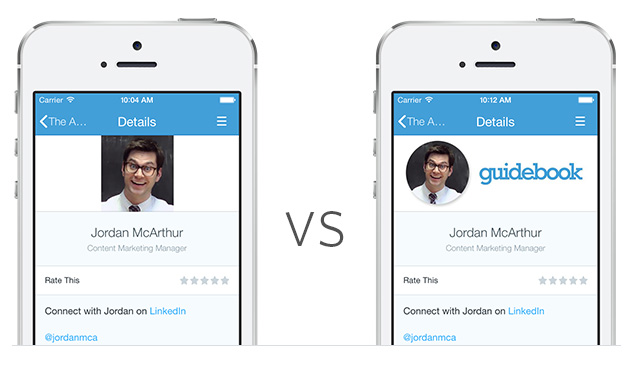
One of the easiest, and most effective, ways you can customize your app is with custom icons. It’s a great way to give your app that cohesive look while making it match your event’s branding and message. Guidebook recommends an icon library of at least 9 icons to make it feel like there is enough variety to distinguish between features. This also gives you the ability to play with color, size and shape.
![]()
Our professional Guidebuilders always tell us that it’s also important to pay close attention to the placement of your icons on the home screen. Again, it’s thinking like a user and working through how to provide attendees with a logical flow. Make sure important features that you anticipate being used frequently are above the fold (on the first page), and that it’s easy to tell the difference between the event’s schedule and the attendee’s personal schedule.
Using photos correctly
By far, the simplest way to make your event app feel complete and rich with content is to add in photos. Allow attendees a chance to attach faces to names on speaker profiles, illustrate abstract concepts and continue to reinforce your branding all by using images.
Just throwing in any old image, however, isn’t a great idea. It’s important that they work with the format. If you’re going to be soliciting headshots from speakers, for instance, they’re probably going to send many different sizes of photos. It’s handy to have a template you can place these into that fits the image window and prevents you from having awkwardly fitting photos.
Link, link, link
One of the golden benefits of your event app is the ability to connect all the information so that one related thing can lead to another and attendees can tap their way to being super-informed. So make sure you take advantage of linking capabilities within your app. Link speaker profiles to their sessions in the schedule, link meetings to their location on the interactive map, and even link slide decks straight into the presentation description.
By linking all this information, you’re creating a deeply rich web of information that adds another layer to the event. Instead of flipping through stacks of paper, attendees can now find exactly what they need with a few taps. The more you connect your information, the easier it will be for them to navigate your app and event. That boosts their overall satisfaction and keeps them coming back year after year.
How do I know if I did it right?
So while you may be a first-time app designer, it doesn’t mean that you have to fly blind and hope that you put everything in the right place. Put your app together soon enough that you can test it out on a small group of people that can give you feedback. You can even pull a classic marketing move and create an ‘A’ version and a ‘B’ version. A/B testing is a great way to quickly learn people’s preferences.
Ed suggests, “Take your prototype to the local coffee shop or the train station to see how people use it. Explain as little as possible and see what they understand and what they assume. After ten people you’ll have a pretty good idea of what you need to to do next.”
Look to the masters
When you’re choosing an event app and evaluating design choices, take your cues from the people who are doing it well. It isn’t hard to find great examples in your everyday life. You just might not recognize them as good design because they fit so seamlessly into your life. Akil recommends taking a look at Google’s most recent redesigns of Inbox and Drive. Ed is particularly fond of Pinterest, Circa, Threes, Google Maps, Letterpress, Youtube, and Dropbox.
You can also borrow from your favorites when customizing your event app design. You might as well steal from the best!
Want someone to give you the real scoop on the best event app design for you? Talk to one of our consultants.