5 Proven Design Tips for Creating a Better Mobile App
App design isn’t as intuitive as one might hope. That doesn’t mean that creating an app that both looks good and delivers results should be out of your reach.
That’s why we’re sharing these pointers on app design. So you, too, can build awesome mobile apps — even if you’re not a design expert.
1. Pay careful attention to the User Experience (UX).
This is especially important when you’re thinking about content placement.
First and foremost, you’ll want to think about how to organize the menu (or “drawer”) that houses all your different features.
Think about what your users will care about most. Is it their schedule? The Interact feed? Whichever features you believe are the most important and deserve the most visibility, house those at the top. This will ensure your users see them first every time they open the app.
Also, be wary of including too many features in your app. Guidebook’s Builder offers you dozens of different capabilities, but that doesn’t necessarily mean you should try them all out at once. Think about what is most important to your app, and focus on building those features out well.
You’ll also want to pay attention to how your content is organized.
For example, there is a large four-day conference, with many concurrent sessions that attendees can choose to attend at any given time. Navigating your master schedule would be overwhelming, but if you plan ahead and create intuitive Schedule Tracks, users are able to filter the schedule down in a much more organized fashion.
A great example of this in action is the Renaissance Society of America (RSA). Their calendar is incredibly dense, and usually, when all that information is packed into one place, you’re at risk of overwhelming your users. Through Tracks, users are able to filter all of this content via different categories.
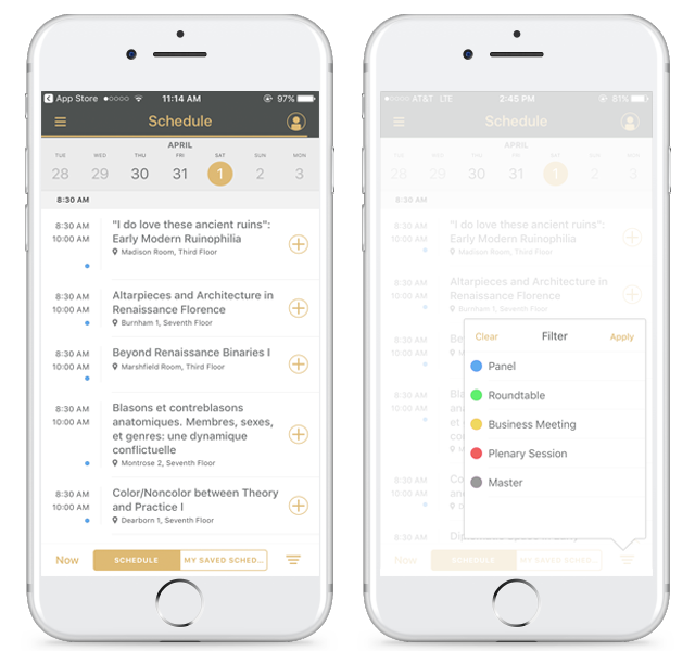
The color coordination creates distinct categories, there are nice contrasting colors, the labels make intuitive sense, and there’s good hierarchy of information. Essentially RSA is able to take something that is inherently risky (having all this information), and organize it in a simple fashion. It results in a really solid user experience.
2. If you’re going Branded, think about all the different elements that you can customize.
Beautiful splash screens, iconography, a properly branded theme, right-sized photography, banner ad design, and consistency throughout.
Tip: Take advantage of the brand assets you already have access to. Any resources your organization has already created for your brand, like graphics and small images (that may double as icons), can be utilized in your app.
3. Don’t choose the colors you like best; choose the colors that match your brand.
This one may seem obvious, but time and time again we see instances where apps have color schemes that don’t match the organization’s actual branding. If you are in charge of creating an app for your org, remember that in most cases, your organization has a set of brand guidelines to abide by — even if you don’t know about them off the top of your head. Ask around before you finalize your theming! Now again this doesn’t apply to you if you’re an individual building an app for a more personal use like a wedding or travel app. But chances are, if you’re opting for the Branded plan, you’re part of an organization that has resources to allocate toward a mobile initiative.
4. For event apps: Think about the role your app plays in the larger context of the overall attendee experience, rather than just as an event app.
This one isn’t a necessity, but it’s definitely something that helps an app stand out from the crowd. Take, for example, ChefConf 2017. It’s an event where over 2,000 members of the DevOps community gather in Austin, Texas for three days of engaging community events, keynote sessions, workshops and more. A perfect example of when an event app shines, you may be thinking. And you’re correct, it is!
But one thing that really makes their app special is the fact they zoomed out and took a view of the event from 10,000 feet. The app creator paid special attention to the fact that their event attendees were flooding into Austin from all over the world, and most likely only a portion of them had ever been to Austin before. So on top of the event app itself, they added a sort of “travel guide” that served these attendees before and after the event’s show hours, too. They gave an inside scoop on great places to eat, bars to network at, sights to see, and more.
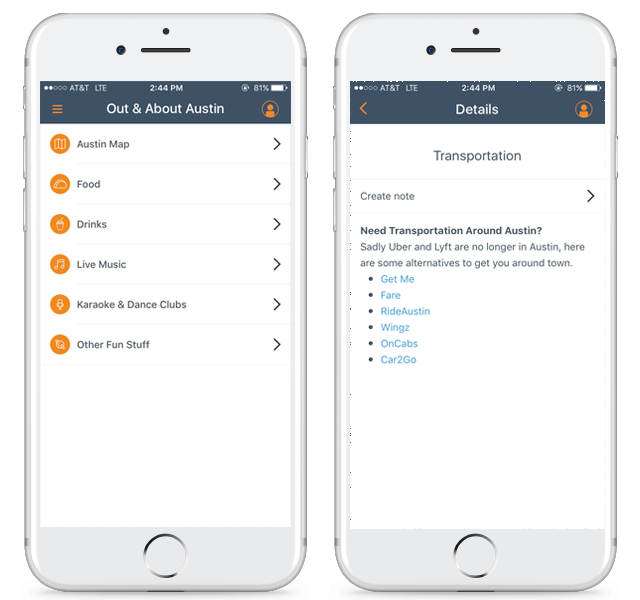
Not only that, but they also included a section specifically to remind users that most ridesharing services that we’re accustomed to are actually banned in Austin, and they provided alternate suggestions that most people wouldn’t know about. (This could also be an opportunity to generate some extra revenue, if they teamed up with these services and negotiated some referral deal!) So even things that travelers might not even think about when visiting Austin, the app creators preemptively thought about and built it into the ChefConf app. Brilliant.
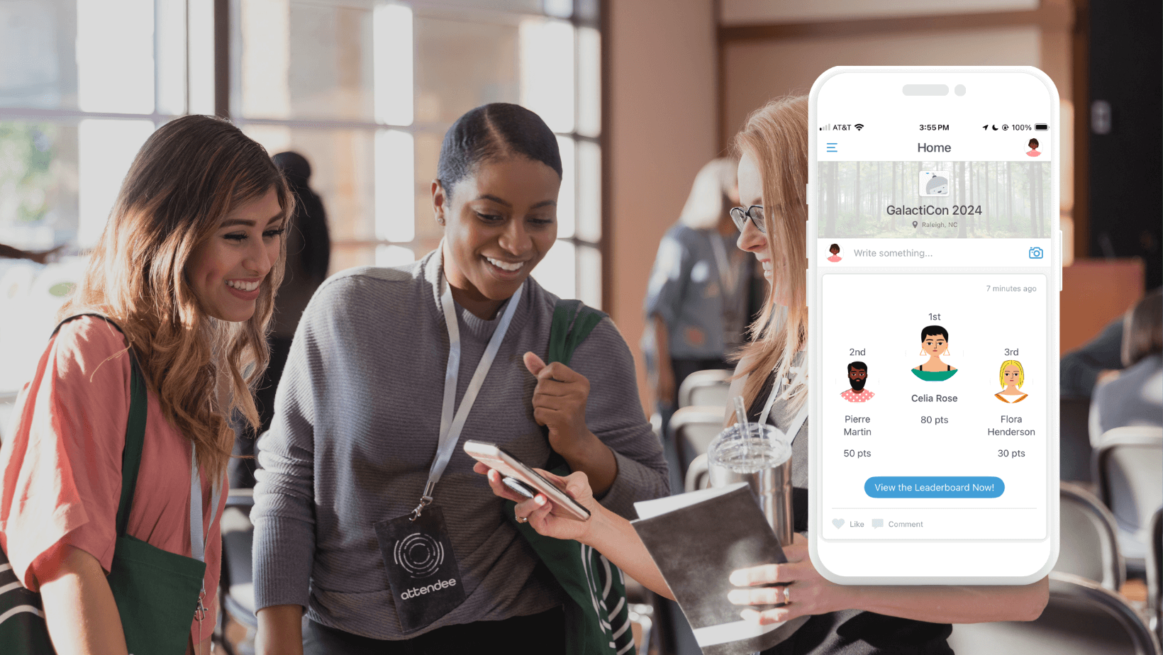
5. Don’t forget about the social feed!
If you’re unfamiliar with what the interactive feed feature is (or Interact, if you do use Guidebook) it’s essentially a one-stop shop for aggregating all the most popular content within your app, in one centralized spot. Whether it’s an upcoming Schedule Session that you may be interested, a keynote speaker that everyone is raving about, a sponsor card, or a whole slew of other possibilities, the Interact feed delivers content to your users in a smart way. Learning algorithms get a sense of what individual users are interested in, and display content that it thinks are a good match for that person. Users can easily share their thoughts insights with others, and you don’t have to worry about placing content in the perfect spot within your app. Just do your best; Interact will help. You can read more about Interact here.