Relive the Music With These Gorgeous Festival Maps
The lights! The sounds! The porta-potties! The incredible memories!
Too beautiful and clever to be crammed into your fanny pack or fringed purse, the very best festival maps capture the flavor of your favorite music festivals. We worked with design nerd and music fan Josh Mishell to provide art-kid commentary–let’s relive some of your memories through these festival maps!
1. Splendour in the Grass
This super-popular festival is THE Australia stop for a diverse lineup of artists from around the globe. And the map is the perfect combination of hand-drawn elements, bright, visceral icons and silly concepts.
“The main goal behind map designs like this is effective communication of where everything is – if you can’t find your way around, it’s not exactly useful, right?” Josh Mishell is a graphic designer and frequent festival-goer. “When you’re in a rush to find the (hopefully clean) portapotties, it’s important to have a clear idea of how to get there–especially if you’ve had a few cocktails throughout the day.”
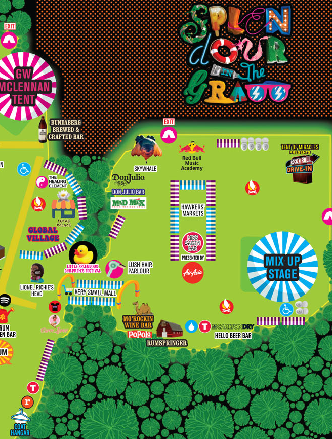

Click to see the whole map!
2. Outside Lands
This San Francisco music festival, staged in Golden Gate Park, is notorious for being enormous, overwhelming and difficult to traverse. This whimsical map captures the madness in a way that actually ends up being informative and nicely navigable.
Josh, who’s seen music everywhere from Tel Aviv to London to “a tiny bar in Toronto”, likes the legend on the Outside Lands map. “There’s even a compass so you can orient yourself, assuming you have the requisite scout training from your youth.”
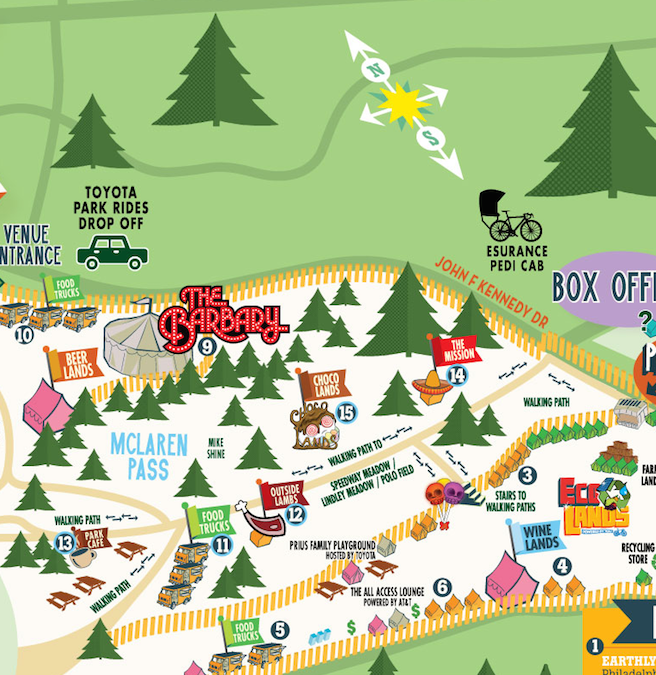

Click here to see the full map!
3. Hangout Fest
This illustrated map captures the reality that this Miami festival is really, really sandy. According to our sources, you’ll find sand in “places you never knew you had”. We also like that the ocean take up 1/3 of the map. It’s like you’re there!
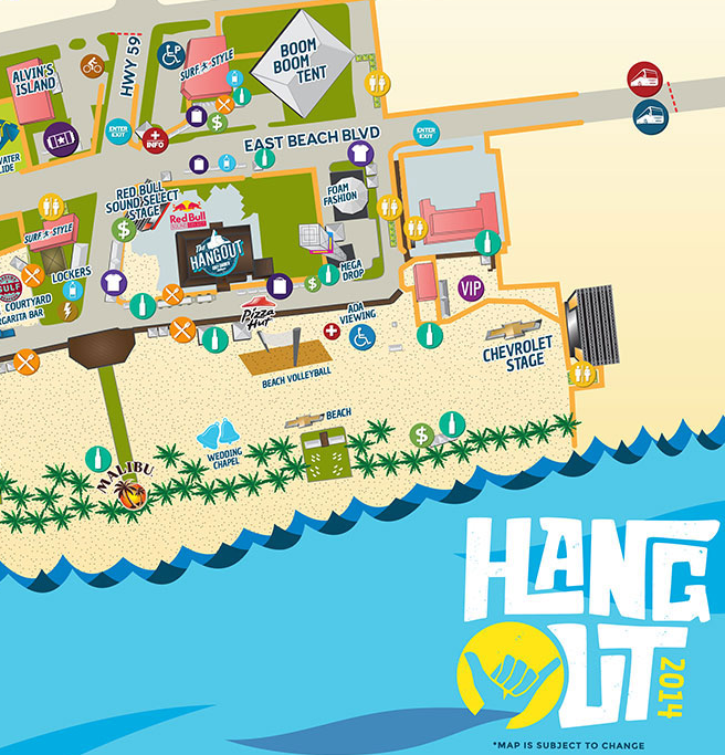
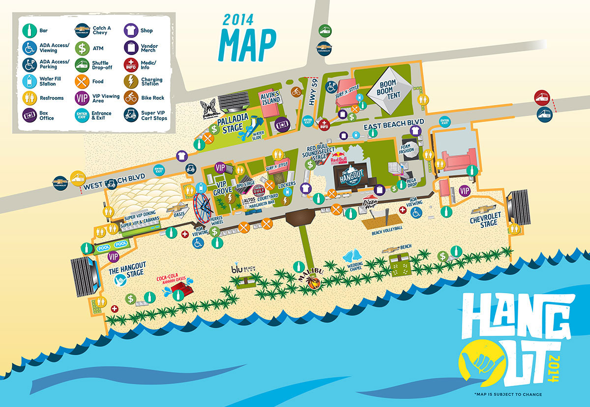
Click to see the whole map!
4. Rocking the Daisies
The map for this near-to-Cape-Town festival resembles a subway map and completely rejects all real-world imagery. It’s clean, it pops, and you’ll never wonder where the beach is (it’s that blue circle, of course).
“It’s a postmodern approach–big time Art History terms happening here!” Josh says. “All you get are the bare details of the event. Nothing is representational aside from the path details and locations of the festival amenities. Their “festival blueprint” takes cues from subway maps, which give you all the pertinent information without the clutter. It’s easy to read, and the contrast of the colors on a black background will help you find what you need with a minimum of effort.”


Click to see the full map!
5. Treasure Island Music Festival
Avast! While the real Treasure Island near San Francisco is largely pirate free, the designers of this map took the on-the-nose approach and drummed up a booty-worthy map to direct partygoers around the venue.

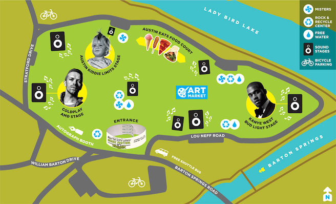
6. Austin City Limits
This pared-down “Survival Guide” map gives you only what you need. Where to eat, where to take kids, and where to Kanye.
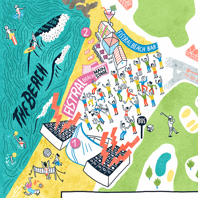
7. Beach Break Live
Beach Break Live, in South Wales, offers up a super-creative illustrated map that really showcases the geographically-driven fun activities you can try as an attendee: surfing, grooving, sports or hanging out by the bonfire.
Josh says: “Music is creative expression. So why not match your festival materials with a similar artistic expression? I love the Beach Break illustration style. It just exudes fun.”

Click to see the full map!
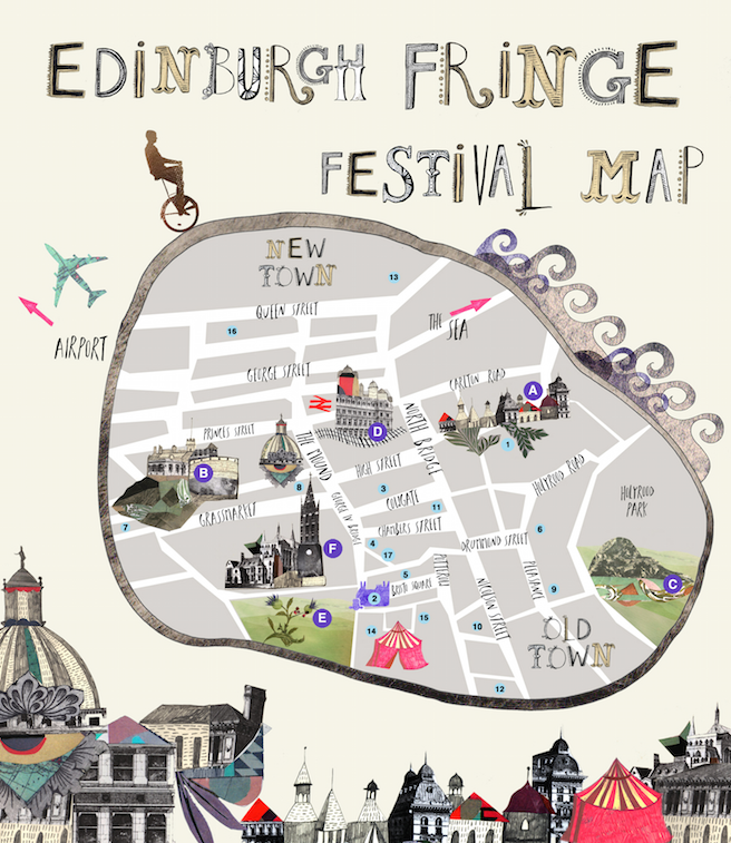
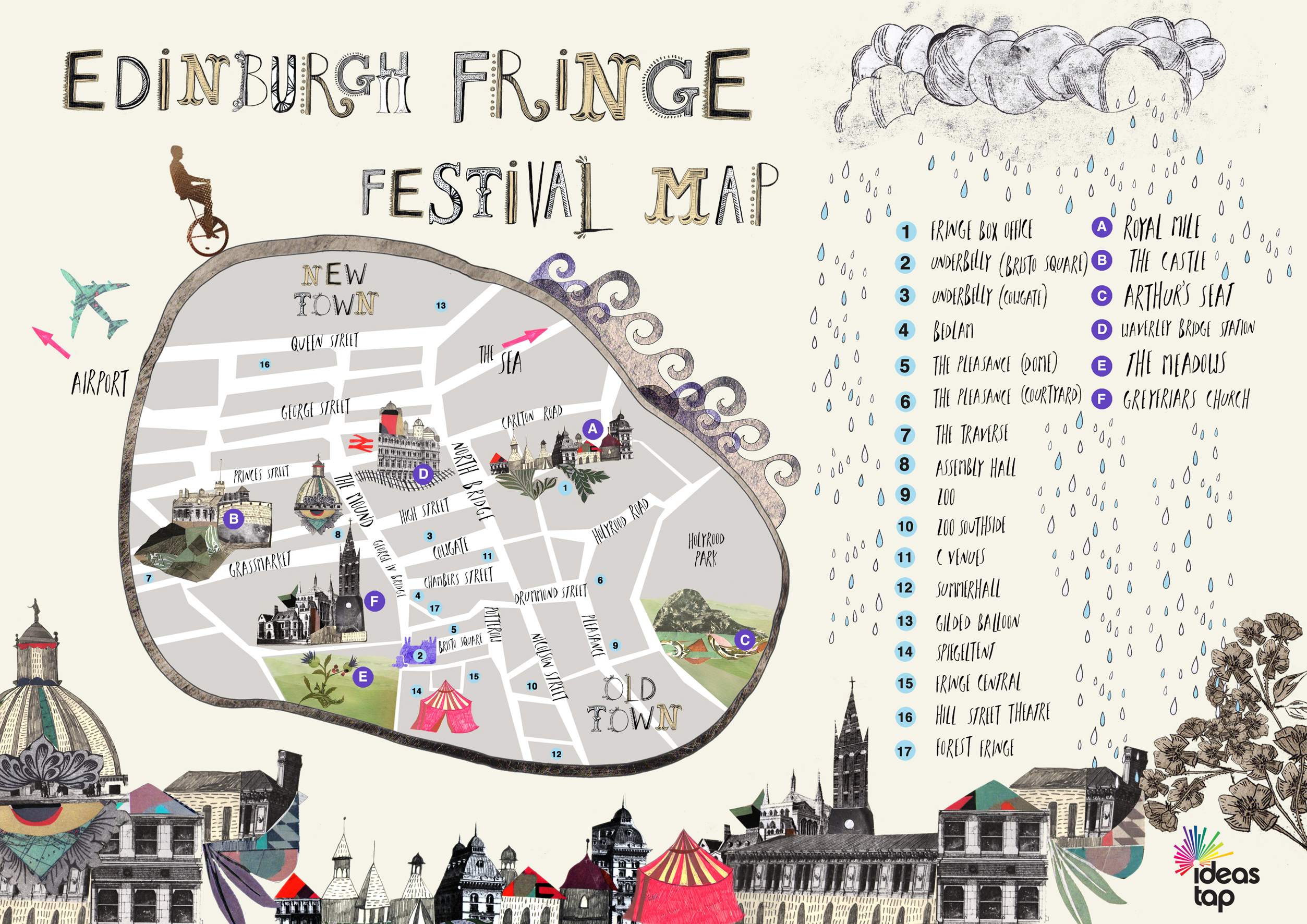
8. Honorable Mention: Edinburgh Fringe Festival
While it’s not strictly a music festival, the Edinburgh Fringe Festival wins points for their delightfully haphazard illustrative style that sums up the event’s famous weirdness to a T.
“It clearly communicates what is where and clearly explains what streets are where. And it’s nice and weird, just like the festival events (and probably festival-goers),” says Josh.
Click to see the full map!
Read on for more about the science of maps and event design! We worked with an experienced digital cartographer who lays it all out.